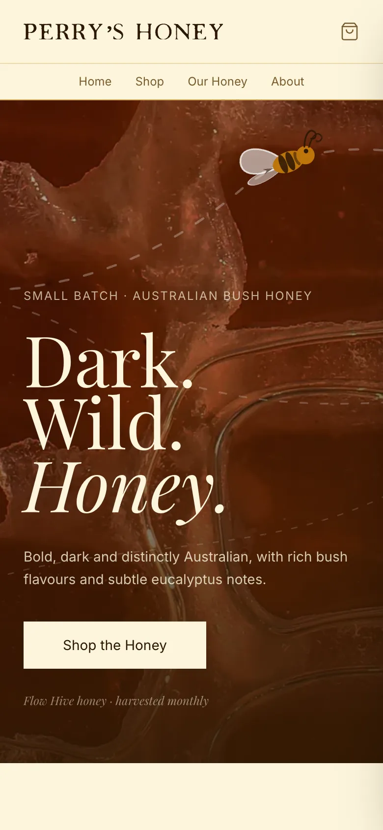
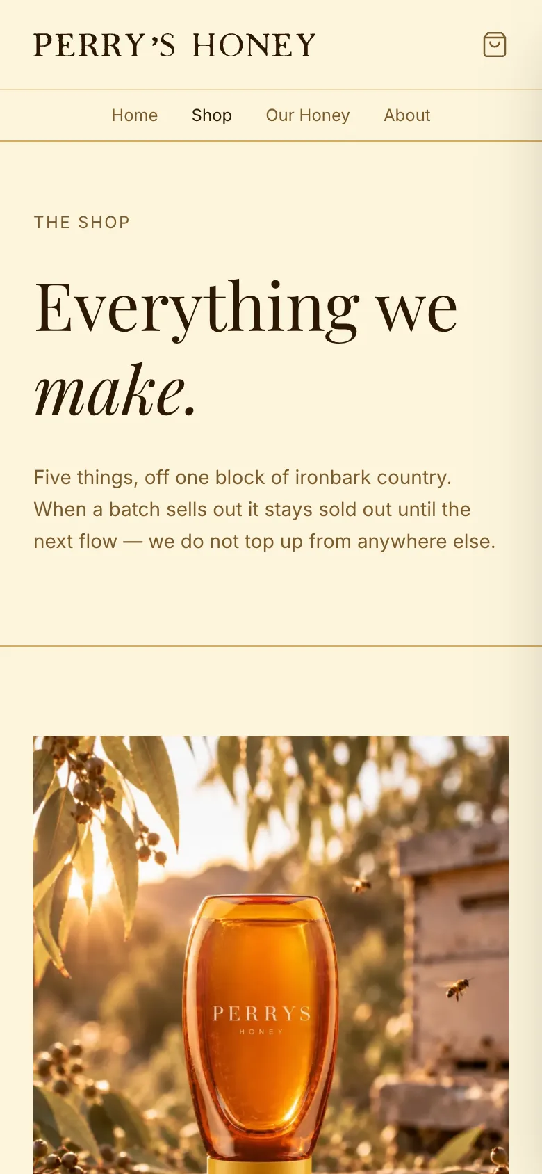
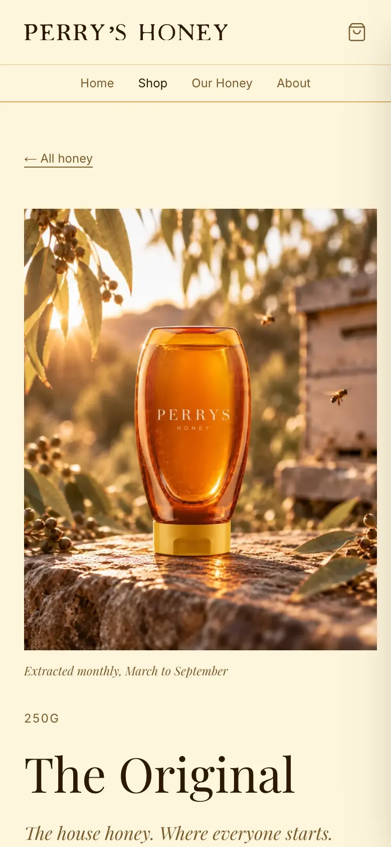
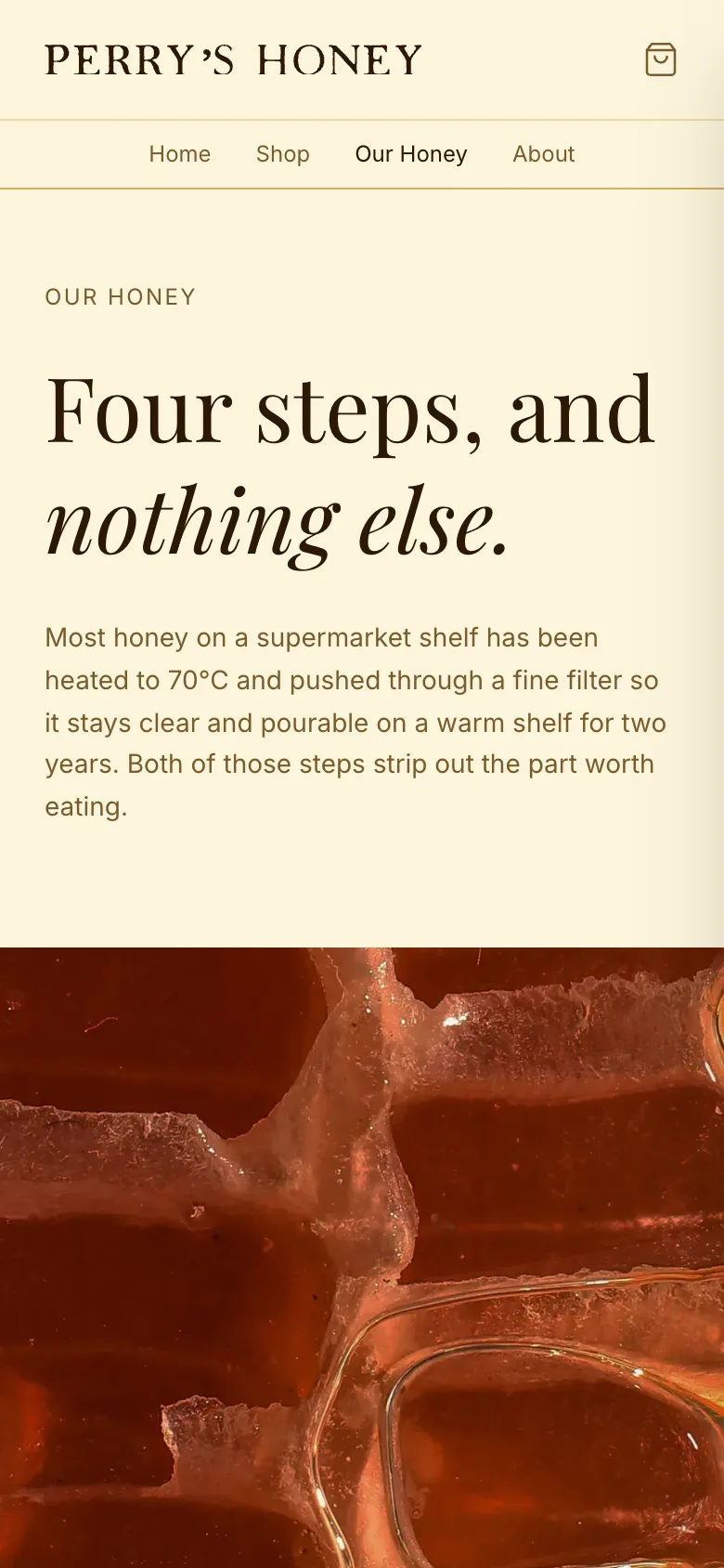
A small-batch honey producer working one block of ironbark country west of Townsville. The brand and the online shop together: the logo, colours and type, the packaging, and a shop with a cart, checkout and an editor so new harvests can go up without a developer.
- Client
- Perry's Honey, Townsville
- Role
- Brand & build
- Year
- 2026
- Work
- Brand identity · Web design · Development · CMS
The brief
Perry’s Honey is a small-batch producer working one block of ironbark country west of Townsville. The honey is raw, unfiltered and single-origin, and it sells out.
They needed a brand that suits what’s in the jar, and an online shop that can take orders.
What I did
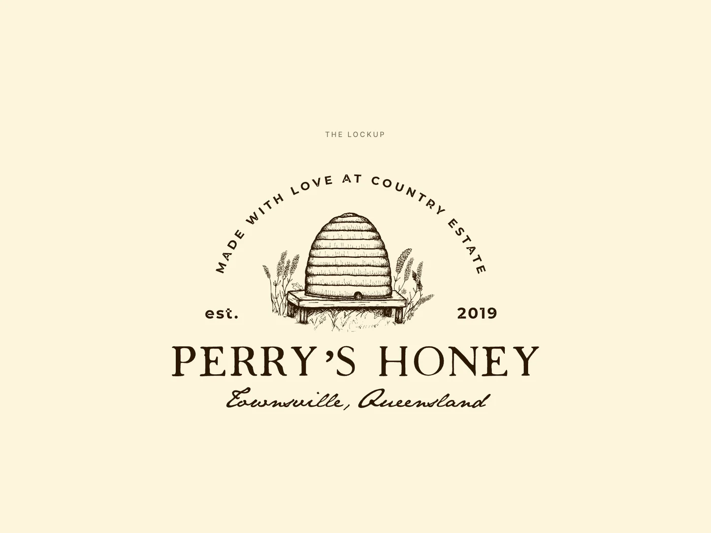
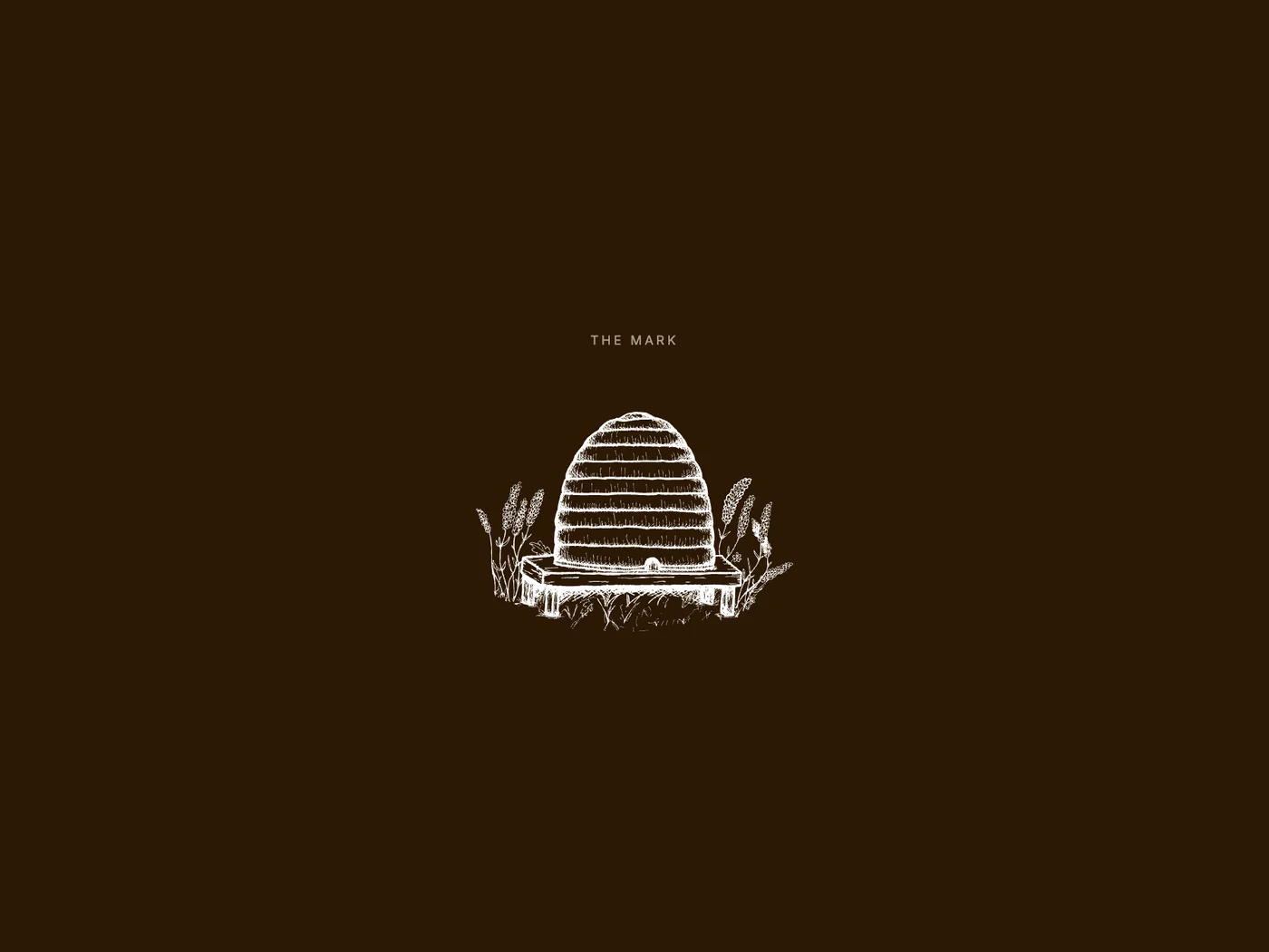
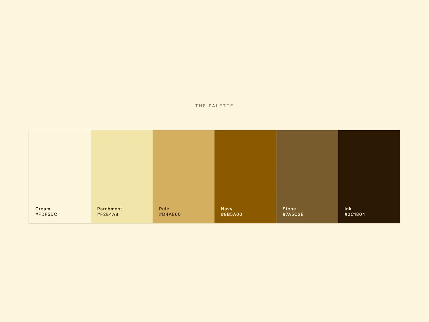
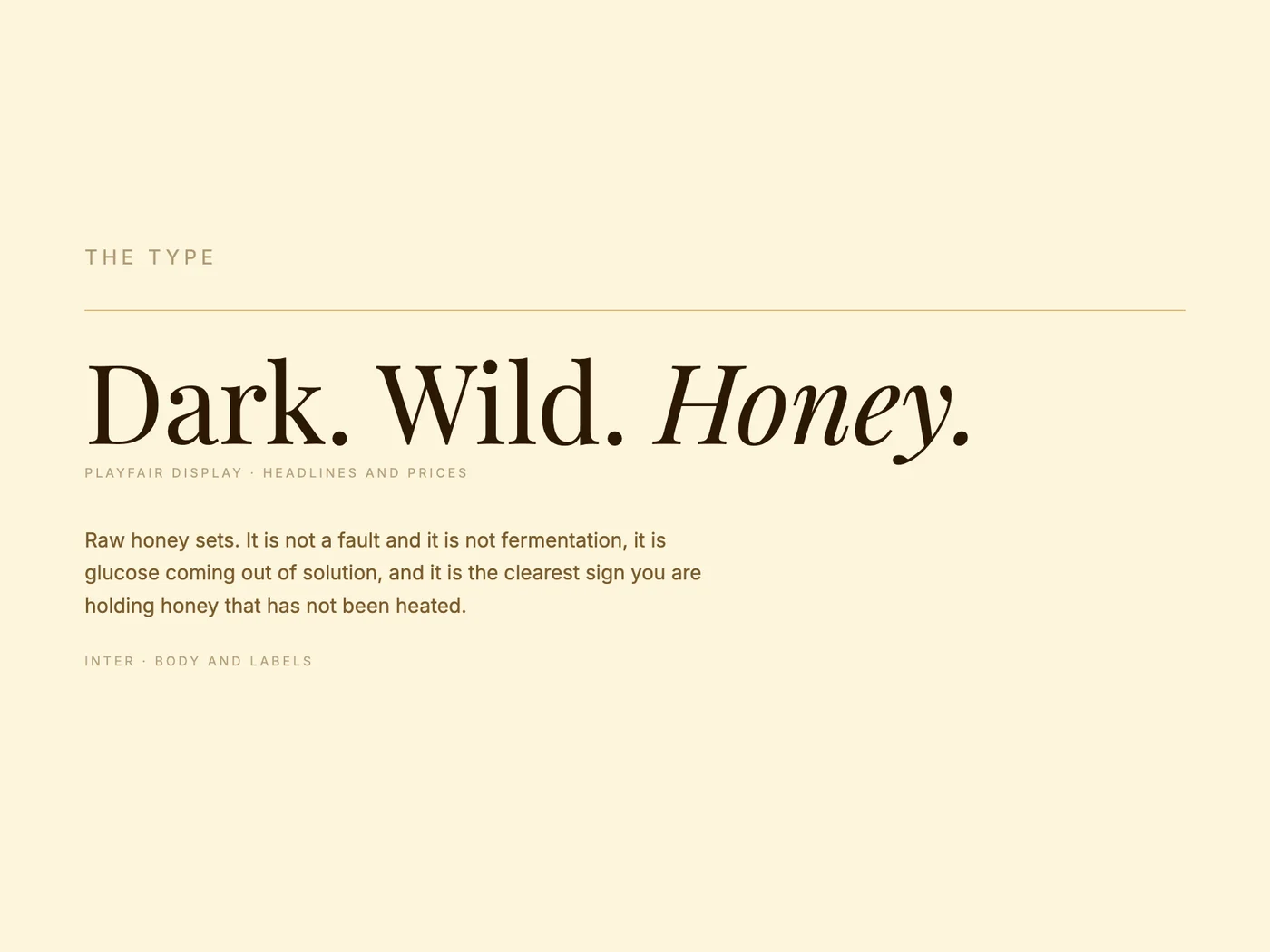
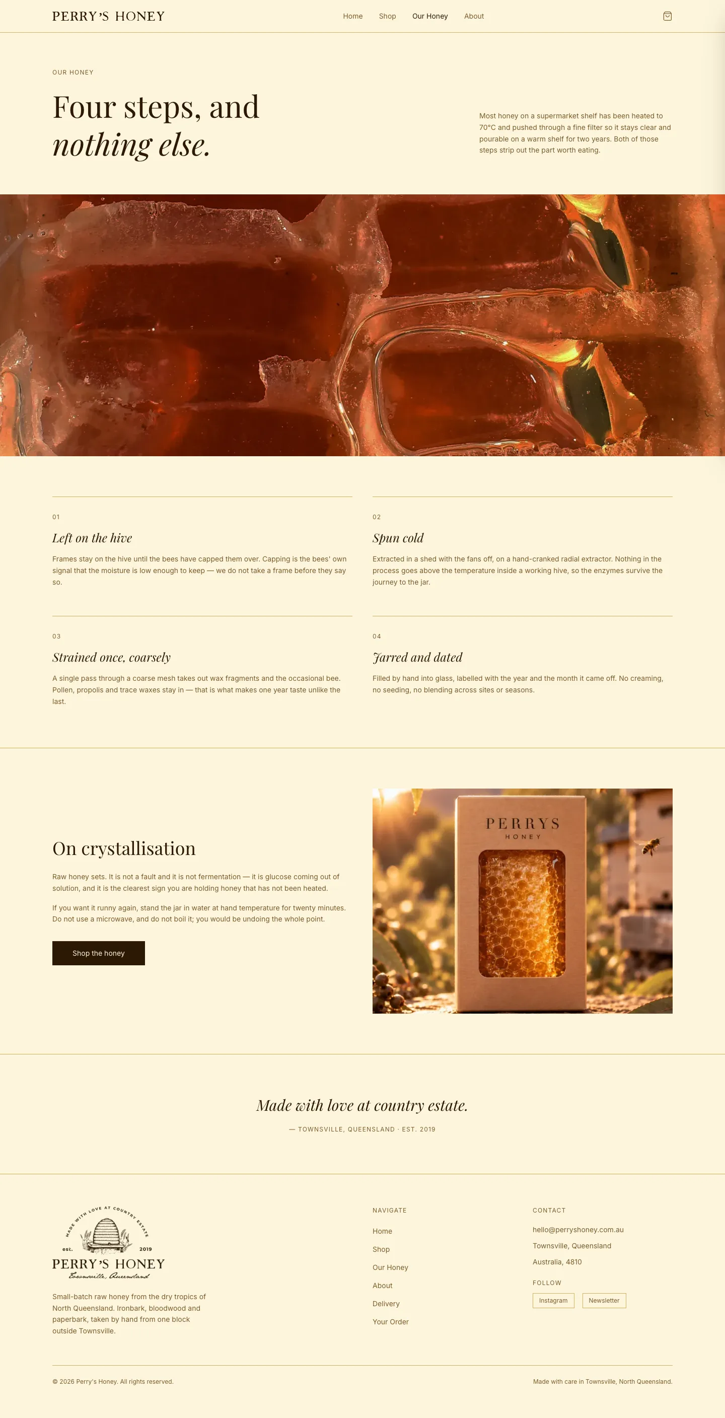
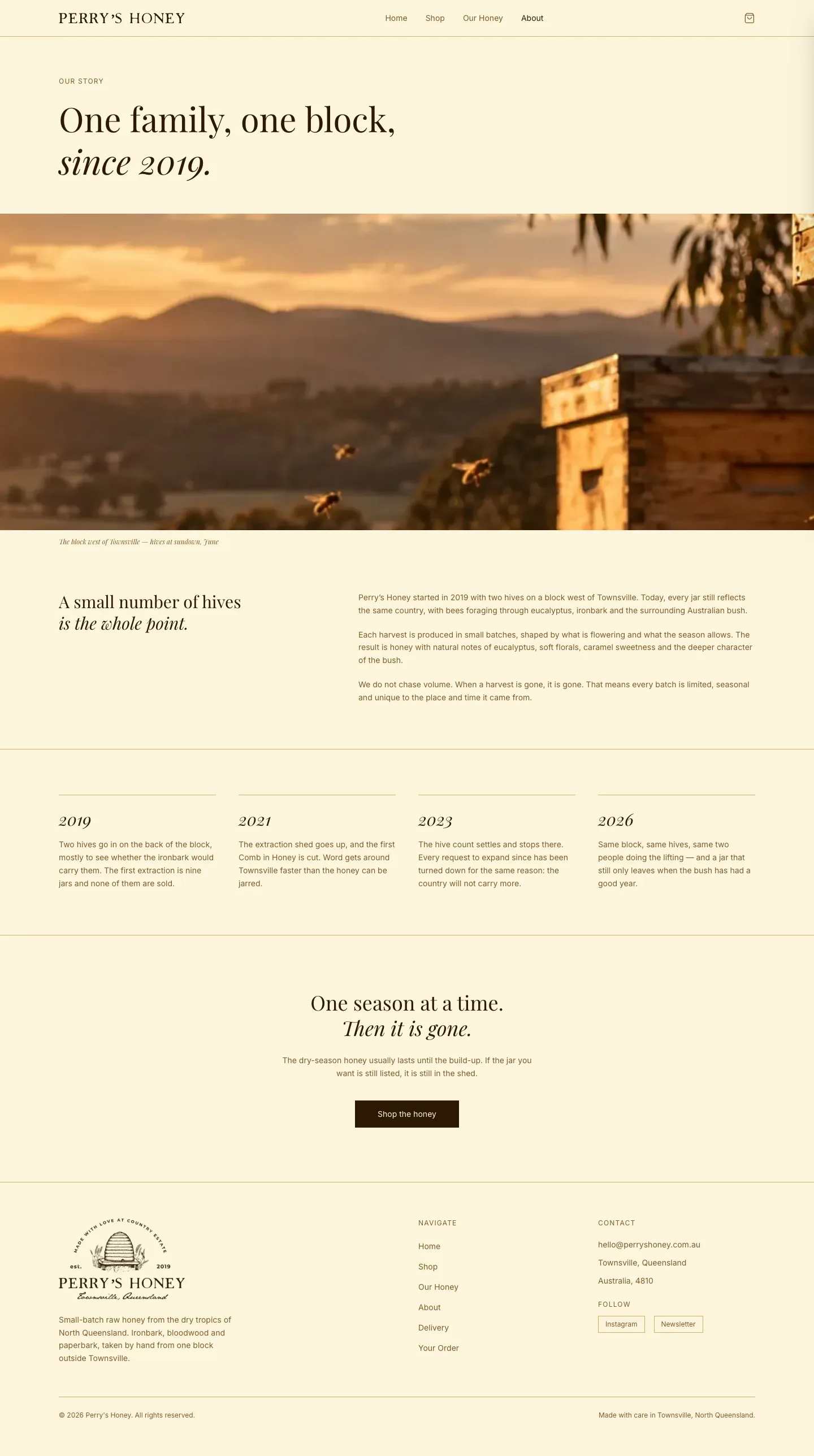
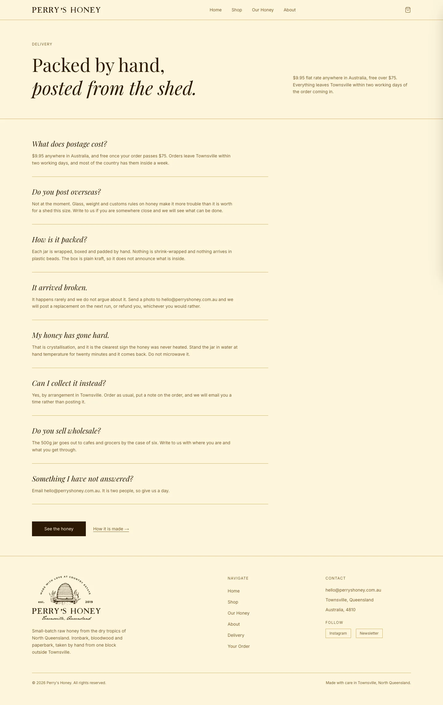
The logo is a hand-drawn hive with the town and year, set in Playfair Display and Inter, in cream, parchment and ink. It feels traditional without trying too hard.
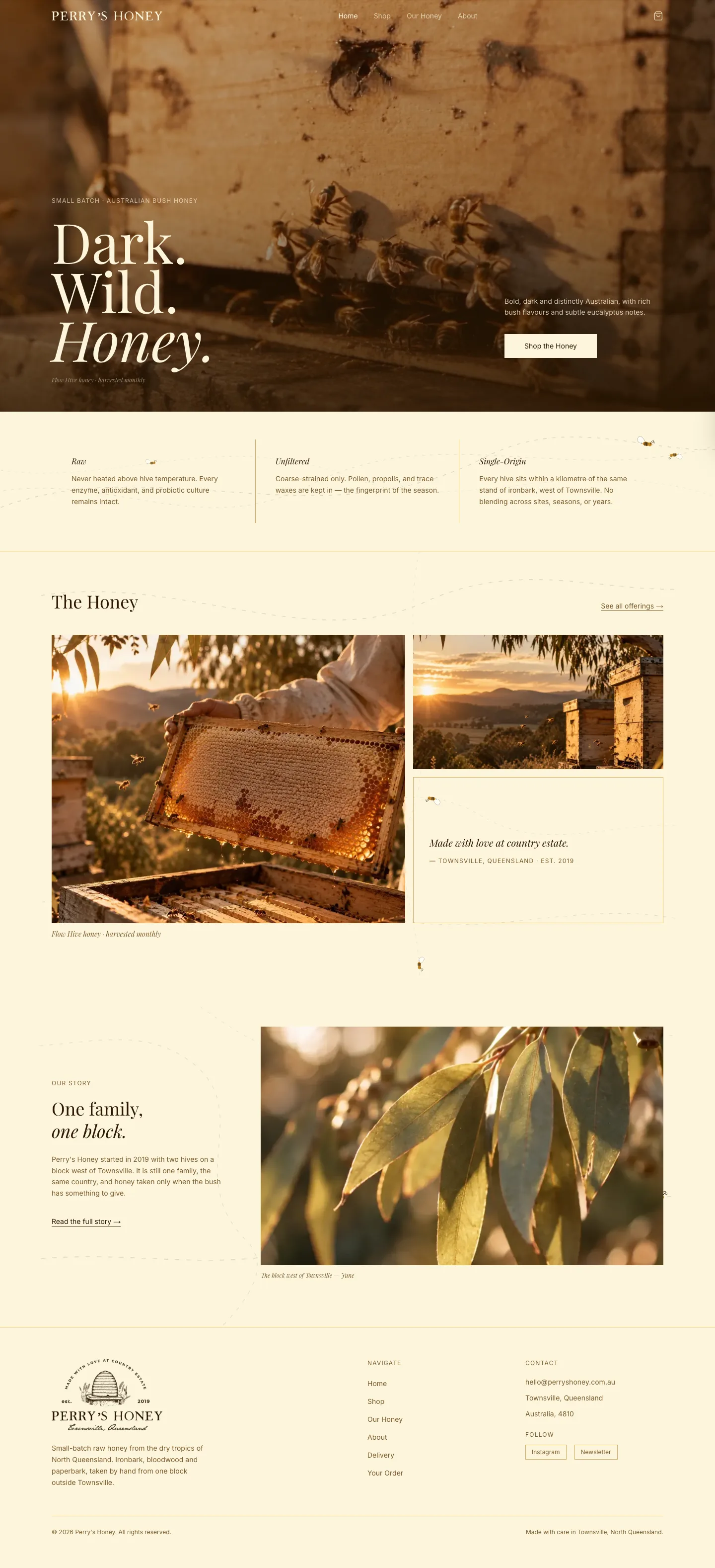
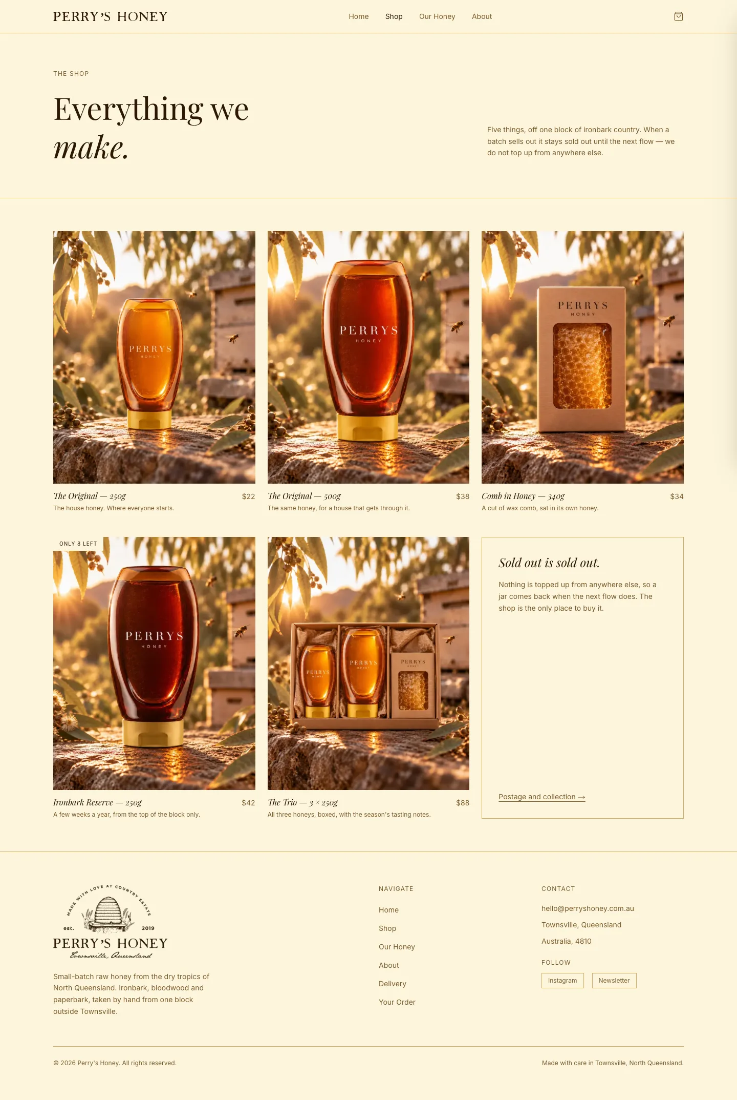
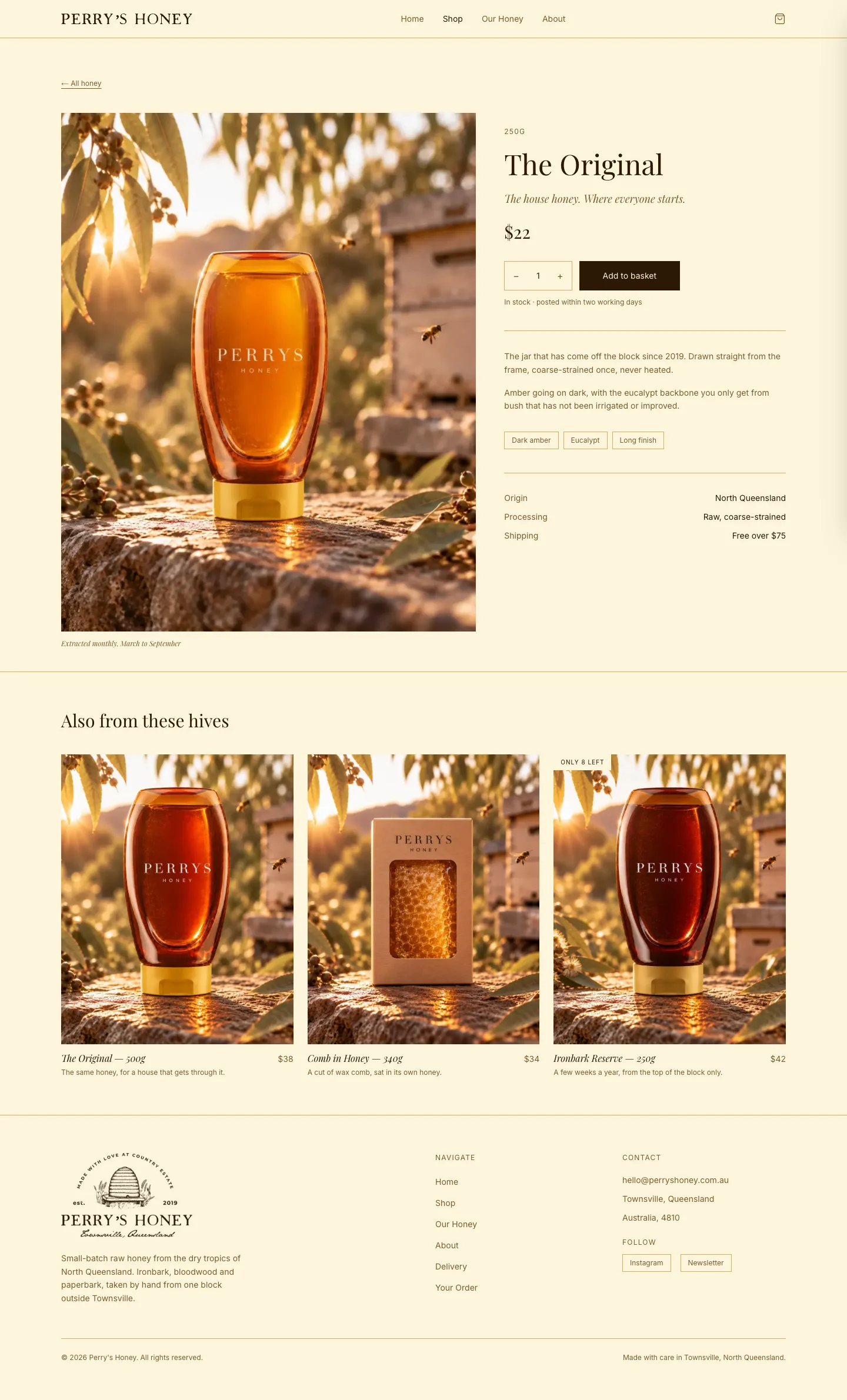
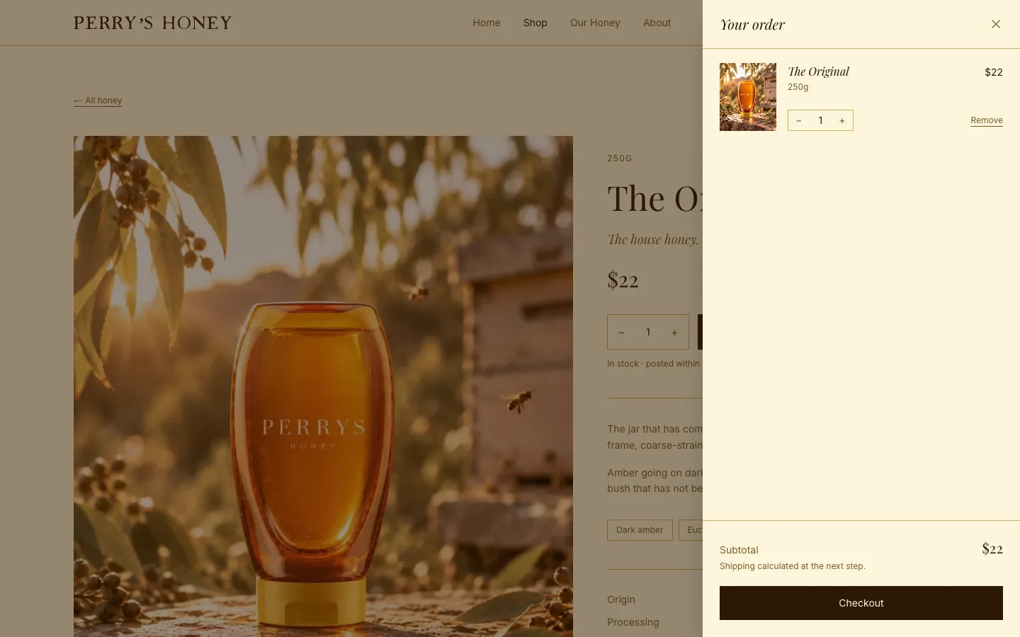
The shop has a cart, a Stripe checkout and an editor, so each new harvest can go up with its own photo, price and stock count. The homepage opens on a film of the hives at sunset.
Where it’s at
Built and nearly ready. It’s waiting on the last bits of business setup, the domain, business name and payment account, and is running on a temporary address until then.
Dark. Wild. Honey.
The brand
Every page
On mobile